Journalists in particular often don't realize how crucial design is to the overall perception of their finished product. While carefully crafted copy and eloquent writing are obviously extremely important, people won't read someone's work unless it is catches the eye in a visually appealing manor. By reading about graphic design principles such as hierarchy, texture, color, rhythm and balance, I better understand all of the elements that go into making my writing stand out as much as possible. When designing this site, I chose to incorporate simple sans serif fonts and tie the separate pages together by using header photos with an industrial/urban feel and grayscale filters. This felt consistent with the professional and clean feeling I want to portray in my work. Below are a few examples of design challenges we completed in class that demonstrate various techniques and programs.
In this class, I learned how to effectively communicate messages visually. As someone who values their writing skills, I've never really been one to consider graphic design in my wheelhouse, but through this course I discovered that visual rhetoric is wildly important. The ability to supplement written content with an appealing and effective visual only enhances the point you're trying to make. Take the big data visualization project (seen under tab "Data Visualization" for example. In this assignment, I analyzed a large data set and was able to turn it into an easy to digest graphic which helps the reader see the main point of the information without me having to explain all the numbers and clutter my writing. This type of work would come in especially handy when producing some sort of news story in which the inclusion of data is necessary.
In this class, I learned how to effectively communicate messages visually. As someone who values their writing skills, I've never really been one to consider graphic design in my wheelhouse, but through this course I discovered that visual rhetoric is wildly important. The ability to supplement written content with an appealing and effective visual only enhances the point you're trying to make. Take the big data visualization project (seen under tab "Data Visualization" for example. In this assignment, I analyzed a large data set and was able to turn it into an easy to digest graphic which helps the reader see the main point of the information without me having to explain all the numbers and clutter my writing. This type of work would come in especially handy when producing some sort of news story in which the inclusion of data is necessary.
Design Challenge: Rhetorical Imaging
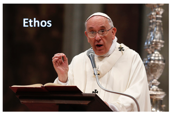
Rhetorical imaging was demonstrated through this design challenge where we were asked to come up with an image that corresponded with a rhetorical device. I chose a photo of the pope as an example of "ethos" because people (especially catholics) tend to inherently trust the pope and see him as a guiding figure.
Design Challenge: Historical Imaging
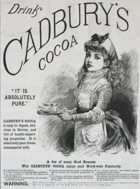
This advertisement for Cadbury’s Cocoa was first published in 1889 as a way to promote this specific brand of cocoa mix. For a bit of context, 1889 was the year in which four states were added to the United States: North Dakota, South Dakota, Montana and Washington. Americans were in a state of discovery at this time.
The portion of the ad that sticks out most to me is the tagline “It is absolutely pure,” which is strategically placed next to the image of a seemingly wholesome young girl holding a cup of Cadbury’s cocoa. She is drawn in great detail and appears extremely lifelike, which definitely adds to the overall effectiveness of the ad. It definitely is appealing to an audience of women and children, as they were the ones who would want to be viewed as “pure.” The ad also includes an information section at the bottom which would qualify as a logical appeal. The ad states “A few of many good reasons why Cadbury’s cocoa enjoys such worldwide popularity” and then goes on to list reasons such as “It is guaranteed to be pure cocoa” and “It can be used as a gentle exfoliant.” These points show consumers facts for why they should buy Cadbury versus other brands.
Design Challenge: Color
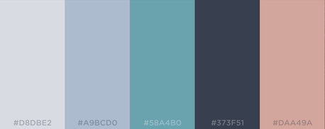
Word: Rest
Colors are muted, soft and neutral, and are the calming colors that make you want to relax and unwind.
Design Challenge: Gestalt Principles
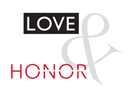
Assignment description:
With your team, use the InDesign typography tools and your knowledge of Gestalt Principles to showcase the principles. For the text, feel free to use your subject matter or another piece of text that invokes specific emotions like "Love and honor."
